Saturday, July 9, 2016

S&P 500. A Breakout is Likely. But This Looks Nothing Like 2013

On April 24th, 2015 we made a judgement that it would be wise for stock market bulls to Tread Lightly. Since then, the S&P 500 has had two 10% + drawdowns, and is virtually unchanged. Most other equity markets fared much worse. Here we are again, but the setup is a bit different this time.

This time the S&P 500 is sporting a chart pattern that suggests a move above the May 2015 all time highs is quite likely. The question is whether such a "breakout" will be sustained or whether it is likely to result in a large "headfake". Our view is that the probabilities of a sustained breakout are low. Let us first look at two reasonable trajectories for the S&P.

A Hyper-Bullish and a Terminal Trajectory for the S&P 500:


We think something like the latter case is in order. Here is why:

1) A relative chart of Consumer Staples versus Consumer Discretionary stocks appears to have bottomed, and is now uptrending. A little thinking would suggest this can't be bullish. This was not the case in 2013 (See Chart 2)

2) A relative chart of Stocks versus Bonds appears to have topped, and is now downtrending. A little thinking would suggest this can't be bullish. This was not the case in 2013 (See Chart 3)

3) Gold appears to have bottomed, and is now uptrending. A little thinking would suggest this can't be bullish. This was not the case in 2013 (See Chart 4)

                                  Staples Divided By Discretionary


Stocks Divided By Bonds


Gold


Admittedly, the phrase used above "this can't be bullish", is a bit strong. Certainly, anything can happen. But that all three charts appear diametrically opposed to their 2013 setup should be alarming. Be safe.

Monday, May 16, 2016

Institutional Investor Teach-in Part 4: Portfolio Optimization

The Science of Portfolio Optimization

Once we have determined how much equity-related risk we are willing to take, and have determined which securities look especially attractive, we put the “pieces of the puzzle” together. We essentially solve for the security weights that yield the highest diversification ratio subject to the risk-budget constraint determined in the first section. Information about this metric is given in the paper “Toward Maximum Diversification” in the Journal of Portfolio Management (Choueifaty and Coignard 2008). Here is a link:


We can now add to the risk-budgeting dashboard by including the resultant hypothetical portfolio characteristics in the table shown below:


There is a lot going on in the table above. In a nutshell, it shows precisely how we adjust the portfolio characteristics based on our view of markets. It bears mentioning that the “Rel Vol” column listed above means “volatility relative to an equity benchmark”. Remember, when we become more cautious of equities, we seek a lower portfolio beta. We solve for the highest diversification ratio at this target beta, and the resulting relative volatility is incidental to it.

Key Takeaway:

Drawdown is inextricably linked to the overall beta and diversification properties of an investor’s portfolio. This part of the portfolio construction process forms the science of our discipline.


Institutional Investor Teach-in Part 3: Security Selection

The Art of Security Selection

Once we determine the appropriate allocation across high/low/alternative beta sleeves, the security selection process begins. Assets are invested using Exchange Traded Funds (ETFs). ETFs have come to prominence in the past decade as an alternative to mutual fund investments. One of their benefits is that they can trade throughout the day and offer the liquidity of a stock with the diversification of mutual funds.

How do we determine which ETFs to put in your portfolio?

First, from a due diligence standpoint, it is worth mentioning that we’ve learned what doesn’t work:

What doesn’t work? The intent is not to sound casual or flippant, although we dedicate little attention to investment-related news, Wall Street analysts, company management, consensus earnings expectations and companies’ self-reported results. We’d rather “turn off the T.V.” and “put down our books.” We have a strong belief that most of the abovementioned sources of information are just “noise.” If this sounds different than what other investment managers say, it should.

To illustrate why, consider the following surprising and unpredicted market reactions to the most important market-related events over the last 15 years:

·         The U.S. hikes interest rates for the first time in 9 years and bonds trade up (December – February 2016)
·         The U.S. loses its AAA credit rating from Standard and Poors and treasury bonds trade up (Summer of 2011)
·         9/11 occurs and oil goes down. The stock market bottoms in 2002.
·         The U.S. Federal Reserve injects money-center banks with over $1 trillion in freshly minted money, and this fails to cause any inflation whatsoever. Commodities plummet (2008 – today)
·         Europe and Japan join the money-printing business, and this too fails to cause any inflation. Commodities plummet (2008 – today).
·         News is extremely dire and the stock market goes up (think year 2013 and consider Greece/Cyprus, the entire European Monetary Union staring into the abyss and the debt ceiling fiasco in October of that same year). The S&P rises 30%.
·         News is extremely positive and the stock market goes down. If someone told you that in 2015-2016 the unemployment rate will be at 5%, that company valuations will be extremely reasonable, company stock-buybacks will be occurring in record numbers, IPOs and mergers will be abundant, inputs costs will be at record lows (thanks to $30 oil), inflation will be low and that CNBC’s Jim Cramer’s favorite stocks — Facebook, Amazon, Netflix, Google — will be near record highs, you wouldn’t have expected two 10% + stock market swoons in the space of 4 ½ months.
·         Companies report blockbuster earnings and often trade down (pick your favorite stock)
·         Companies report disastrous earnings and oftentimes trade up (pick your favorite stock)

What does work?

Controlling Costs

As mentioned, we in exchange-traded funds (ETFs). There are over 2000 such funds, but many of them trade infrequently and charge high annual expenses. We don’t invest in those. Instead, we choose from among the most liquid, and least costly ETFs in the world to form an investment universe of about 200-250 ETFs. In other words, we capitalize on the attribute that investors have the greatest control over – costs. The cost of investing is perhaps the only part of the total return that one can control.

Understanding Supply and Demand Dynamics

From here the investment selection process becomes a work of art:

The basis of our work is an interpretation done each week of the chart patterns of almost all listed stocks and virtually all OTC stocks for which there is sufficient daily trading activity on which to form an opinion. On average, the universe of stocks, ETF and Indices comes to 5,000 individual names.

In this “bottom up” approach, judgments on individual stocks are synthesized to arrive at broader judgments on the prospective action of industry groups, market sectors and finally, the market as a whole (all of which can be invested in via ETFs). The approach to larger groupings is inductive. The objective is to be “right” in the interpretation of individual chart patterns and thereby to be right about the larger sectors, and ultimately the market as a whole. We form our opinion about every ETF based on this bottoms-up approach.

The investment universe reviewed each week is re-evaluated and updated daily for the purposes of monitoring and acting upon, as the reader will soon see, the “footprints” left by the “the Big Boys,” or larger investors.

The approach is not only purely technical (in that fundamental factors are not taken into account) but limited to an analysis of four data points: high price for the day, low price for the day, closing price and share volume traded for the day. Relative strength (i.e. how well an ETF is doing compared to the market), and moving averages are heavily relied on, but they derive from these four bits of data. Thus, the work consists purely and simply of pattern interpretation. What we will attempt to show next is that technical analysis, in coming of age, has become increasingly unbuttoned. It has long since reached the point where a case can be made for it to form the backbone of one’s investment thesis.

In essence, we actually study the supply and demand for shares directly. After all, every important change in a security’s price and volume can be thought of as changes in the supply and demand for its shares. What’s more is that it has become increasingly well known that the biggest changes in share supply and demand come from large institutional investors. This particular group has grown to have the largest influence on a security’s price. We simply try to understand their “footprints.”

Key point. It makes no difference if we are right, fundamentally, about a particular investment or market circumstance. If the “Big Boys” at Fidelity, T. Rowe Price, Vanguard, or Blackrock are selling, the security in question will go down even if we think the fundamentals suggest the opposite. The list of unpredicted market examples mentioned above provides the evidence one needs to know that fundamentals can’t be the only driver of changes in security prices.

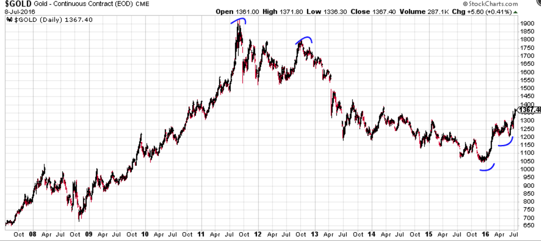
So what kind of chart patterns are we looking at?

Simply saying that we form our opinion about a particular security based on the impression that its chart gives us shouldn’t be enough. That would be like the reader trying to picture what the Mona Lisa looks like from someone else’s verbal description. That description might read like this: 

“She is sitting with her arms folded; she is pale, but has a slight glow; her expression is somehow both stoic, pleasant, and serious all at once; trust us, this is what she looks like!”

Showing the actual picture would be appropriate now. Not the Mona Lisa, but our picture:


Disregard the coloring of each data point and look at the two parallel lines drawn below. The chart below is of the U.S. Dollar ETF (ticker: UUP) from June 2013 to June 2014.  What should be clear here is that the two parallel lines form an important boundary. It is in this boundary that share supply and demand appear to be in balance. 


Notice one key feature of the chart above. Look at the arrow just below the lower parallel line. This arrow shows that a slight amount of trading “action” took place outside of the equilibrium zone only to quickly reverse course. The message that this chart is beginning to convey is that those traders have become “trapped” selling below the security’s fair value.

Now look at the next chart below.  This is the same security several weeks later. We have added two important pieces of information. This chart shows that the security successfully “re-tested” near the point where the “trap” occurred, and never traded lower. It also shows that price action resumed northward and actually broke an important downward sloping trendline. We have a potential change in trend underway, all “kicked off” by an initial “trap.”  It is at this point that we would buy the security. We have fulfilled three criteria that form the backbone of our security selection process: a trap, a successful re-test and a break of trend in the opposite direction.


What ensued for the U.S. dollar was quite breathtaking see chart below:


What the above three criteria ensure is that we are not the “first builder on a vacant lot”. We wait for price action to stabilize before buying. We avoid catching the proverbial “falling knife”. This ultimately protects investors from drawdown. We protect you at the security selection level.  We anticipate sellers to become “trapped” out of their positions only to have to buy later at higher prices. This in turn, fuels more buying. We buy as soon as the overall trend changes from negative to positive.


Key Takeaway:

Drawdown is ultimately determined by security selection. It is important to select securities based on cost considerations, and an analysis of the supply and demand of shares directly.


Institutional Investor Teach-in Part 2: Risk Budgeting Methodology

The Art of the Risk Budgeting Methodology -
How Much Equity-relative risk should we take?

We utilize a set of qualitative factors that determine roughly how much equity-relative risk we are willing to take subject to the risk-band that is appropriate for the reader/client. It is a holistic approach. As displayed in the checklist below, overall portfolio risk metrics will fluctuate with changes in the market outlook. Unless otherwise specified, an “impression” is formed visually by making simultaneous use of weekly (5 year), daily (2 year), and hourly (3 month) timescales using open/hi/low/close charts:

  • Implication for equities based on impression of defensive assets (Yen, Precious Metals, Treasuries, Utilities)

_____     _____     _____

Good      Average  Poor

  • Impression of cyclical assets (Emerging Markets, Non-Precious Metal Commodities, High Yield Fixed Income Relative to Low Yield, Energy/Materials/Industrial S&P GICS Sectors)

_____     _____     _____

Good      Average  Poor
  • Equity Market Participation (Russell 3000 performance relative to S&P 500 and DOW 30)


____     _____     _____

Good      Average  Poor
  • S&P 500 Chart Pattern
    • Hovering near highs at abovementioned timescales?
    • Stready trend in-tact at abovementioned timescales?
    • Hovering near lows at abovementioned timescales?
    • Stready downtrend in-tact at abovementioned timescales?
    • Bullish "traps" over abovementioned timescales?
    • Bearish "traps" over abovementioned timescales?

Based on Yes/No Above

_____     _____     _____

Good      Average  Poor
  
Beta Targets >>                           Aggressive            Balanced
Mix Good/Avg or All Good         0.75 or higher       0.50 or higher
All Avg or >=1 of Each                0.65 - 0.75            0.40 - 0.50
  Mix of Avg/Poor or All Poor              0.65 or lower          0.40 or lower


  Ex. Asset Allocation                          Eq/FI/Alt                 Eq/FI/Alt

Mix Good/Avg or All Good          >90%/5%/5%       >80%/15%/5%
All Avg or >=1 of Each                80%/10%/10%      70%/20%/10%
Mix of Avg/Poor or All Poor               <60%/25%/15%     <50%/40%/10%


There is a lot “going on” in the table above. To be precise, the message is: when market conditions deteriorate, we generally take equity exposure down, and vice versa. In the next section, we’ll examine how we select individual securities.

Institutional Investor Teach-in Part 1: Investment Philosophy

This teach-in details our investment philosophy and is intended to resonate well with our institutional readers/clients. We assume a client persona that wants to be 100% invested and is long-only. As will be illustrated, this does not mean that the client necessarily has any real (or net) “exposure” to a particular equity index. In other words, what this paper really hopes to expound on is the art and science behind an absolute return strategy. Lastly, it is worth mentioning that a long-short version of this paper can be adapted for hedge funds with just a few basic changes.


Our Investment Philosophy
“Safety-first” forms the foundation of our investment philosophy. It is similar to the Hippocratic Oath to which every medical doctor must ascribe. The spirit of that oath is to, “do no harm.”  Keep in mind how the asset manager and other stakeholders work together to attain this goal.  We work with stakeholders to gauge their risk “appetite.” Based on that risk appetite, a risk-band is established for the client. Internal risk models are then used to vary risk along this pre-specified band in light of market conditions.

Most investment management firms look at risk under a single light. For most, risk is defined as the day-to-day variability in returns. That is a very valid approach to viewing risk, but it is not without flaws (as will be demonstrated). But we focus on a more intuitive notion of risk, and define it in terms of potential drawdown in wealth. Drawdown is defined as the peak-to-trough decline between any two levels of wealth. From a risk standpoint, we believe that it is ultimately drawdown that investors care about (“What is the most I could expect to lose?”). Consider The Following Chart:

Would it not be perfectly acceptable to have wealth increase along a line that isn’t “straight” (i.e. one that has a lot of variability)? Of course! Would it somehow be acceptable to have wealth decline in a straight line? After all, there is no variability in a straight line. The answer is, of course not!

Now consider the following fact: most risk models see the orange line (above) as having more desirable risk characteristics. The blue line (above) would be penalized for having more “zigs and zags.” Thus, despite the fact that the blue line has about half the drawdown as the orange line, the blue line would be deemed riskier. Even Wall Street has fallen for this trap. The reason for this is that variability is an easier metric to build risk models around. We are not about building risk models that are convenient. We have gone the extra mile to ensure that portfolios are robust to large drawdowns as well.

Here is another way to look at drawdown. As mentioned, most risk models are flawed because they only consider the day-to-day (week-to-week) variability in returns. They don’t consider that it is the incremental compounding of consistently negative returns (the orange line) that lead to undesirable investor outcomes – large drawdowns.

We believe that to prosper as an investor, one has to position an investment portfolio to minimize the probability of large drawdowns. Drawdowns have another important implication, they make the probability of ever getting “back to even” significantly lower. Think about how the compounding of returns works. It is helpful to illustrate this principle by utilizing an extreme example. If an investor loses 50% of her wealth, say $1M falls to $500K; then in order to get back to even, they need a 100% return ($500K back to $1M)! It should be clear now that it is drawdown which is the real enemy of investing. It should also be clear that drawdowns are not only unpleasant because people don’t like losing money, but because the burden becomes ever greater to recoup those losses. This is not a trivial observation. Consider the chart below:


Consider the fact that both lines in this chart have the same average return. The same arithmetic average. Starting from the $100 level, both lines averaged exactly 16.67% over the next three measuring points. But here the orange line dominates the blue line. Why? Less drawdown. By experiencing a maximum drawdown of only 20%, the orange line only had to gain 25% to “get back to even”. The blue line, having declined by 50%, needed a 100% return to do the same.

In the next section, we describe how to construct a portfolio to minimize drawdown.

Key Takeaway:

The “safety-first” principal has real mathematical underpinnings in the investing domain. It should be clear that we are not just stating the obvious by saying that avoiding large drawdowns in wealth is the key to prospering as an investor.

So how do we determine if market conditions are favorable enough that we would be willing to take more risk, or whether they are exhibiting the exact opposite condition? The answer to that question will come in the next two sections. As you’ll see, we are unique in that we actually form an opinion about the overall market based on the health of its constituents – a true “bottoms-up” process.


Thursday, August 6, 2015

Buy or sell the stock market? Price action will tell us: 8/6/15

We are trading around a critical Origination Point (OP) right now, The price action will tell us whether to buy or sell


The potential FH1 on the daily chart tilts us toward a short bias, BUT if we don't break below OP and fail to form value zone below the OP, we are looking for BOT to take long. PRICE ACTION WILL TELL US WHAT TO DO.


Wednesday, August 5, 2015

How to trade the PM long, AXP short play: 8/5/15

Below we have what we're looking for from an execution stand-point for the long Philip Morris International, short American Express trade.

Acronyms are discussed in prior posts. If you would like details on anything discussed in this post, please post a comment and we will respond promptly.

Long PM


Short AXP


Long signal forming on stock market: 8/5/15

It looks like our low may have been put in at 17,319 temporarily on the Dow Futures. If BOT is successful, that statement will be strengthened. We had a pullback to OP of up move last week on Tuesday. We had a bear trap- failure to continue lower (blue circle) after hours last night and today we have a potential break of trend long on the 1 hour Dow Futures with a down trend line retest.

Below chart has details:


Friday, July 31, 2015

Long Philip Morris International, Short American Express

We are suggesting going long Philip Morris International (ticker: PM), and short American Express (ticker: AXP). This is yet another longer term, defensive, pairs trade idea that should benefit from overall market action that is either sideways or down. 

The charts for both PM and AXP are classic. PM is consolidating near the high end of a long term range after an uptrend. We feel that enough time has been spent in this range to warrant a decisive breakout, especially when considering that other tobacco stocks such as BTI, RAI, and MO have exhibited powerful relative strength of late. 

PM


The reverse is true for AXP. Instead, it is exhibiting all of the characteristics of a stock ready to break down. Here we see a long term trendline break with action near the bottom of a consolidation range that should finally give way to more downside.

AXP


Disclosure: The author took this pairs trade yesterday.

Bottom on the DOW for the day 7/31/15: OP retest and Low trade volume (trap)

OP retest and low trade volume trap could signal that the DOW bottomed for the day. If not, it's given us enough of a move in our favor on the short-term BOT that we're risk-free on the trade. So, it's considered a good "attempt" now.


First, the Origination Point (OP) retest, highlighted with blue circles. We wiped out the up move gains, stopping traders out the caught that long leg starting yesterday.

Second, low trade volume at low of day, 4 contracts traded; circled in green on the right of DOM.

If we hold a higher low today from yesterday, the long BOT longer-term is still intact. Being that we set a new high today compared to yesterday, the structure is still in place for the long BOT.